Foster + Partners successfully replies to Apple Inc.
Foster + Partners opens the doors to its new flagship store in Milan.
One week after its opening it’s now clear that it’s more than an ordinary shop, we’re talking about a real masterpiece of architecture.
The Italian brand manager.
Apple store, piazza Liberty, Milan.
© Foster + Partners
July 26, the grand opening of the new store in Milan has stolen visitors even to the close Duomo, but after the opening ceremony the architecture remains.
Him

Jonathan Ive
Apple’s chief Designer Officer
Supervised and took care of every finishing.
She

Angela Ahrendts
Apple’s Manager
Showed the shop to the people after a sleepless night spent between mosquito repellent and a bit of anxiety.
The Architect

Stefan Behling
Foster + Partners’s Head Designer
The mind behind the many Apple stores designed by Foster + Partners all around the world, such as those in san Francisco, Dubai, Macao and many more.
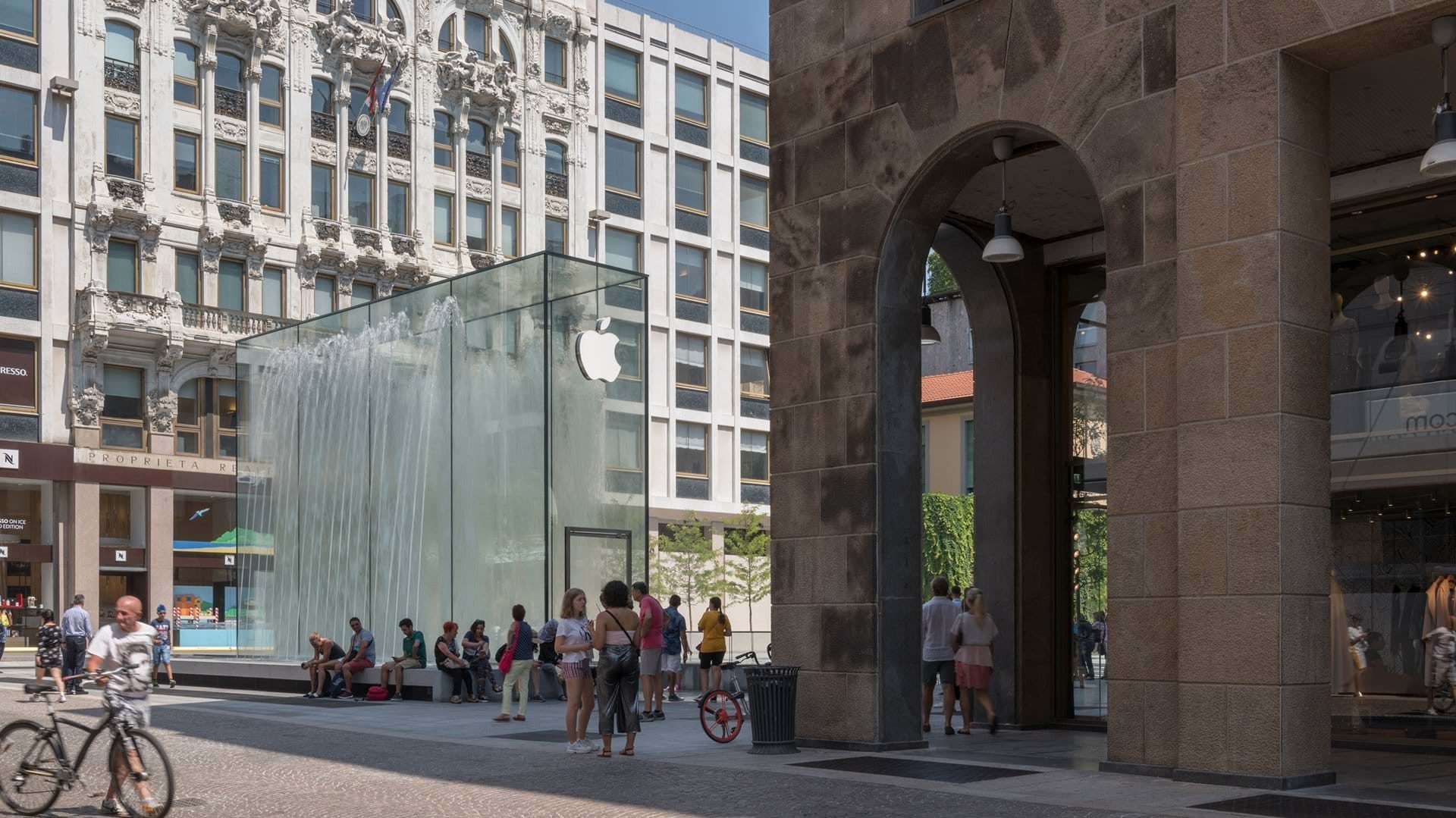
“There is no Italian piazza without a fountain”, Fontana di Trevi in Rome, la “Torta degli sposi” (The wedding cake fountain) – named after its wedding cake shape – of piazza Castello in Milan are just a few examples; Stefan Behling brings back water and stones in an age ruled by Wi-Fi connections and high-resolution monitors.
Contemporaneity and tradition, an Italian tradition, shake hands.
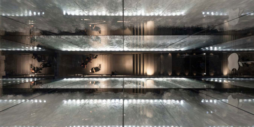
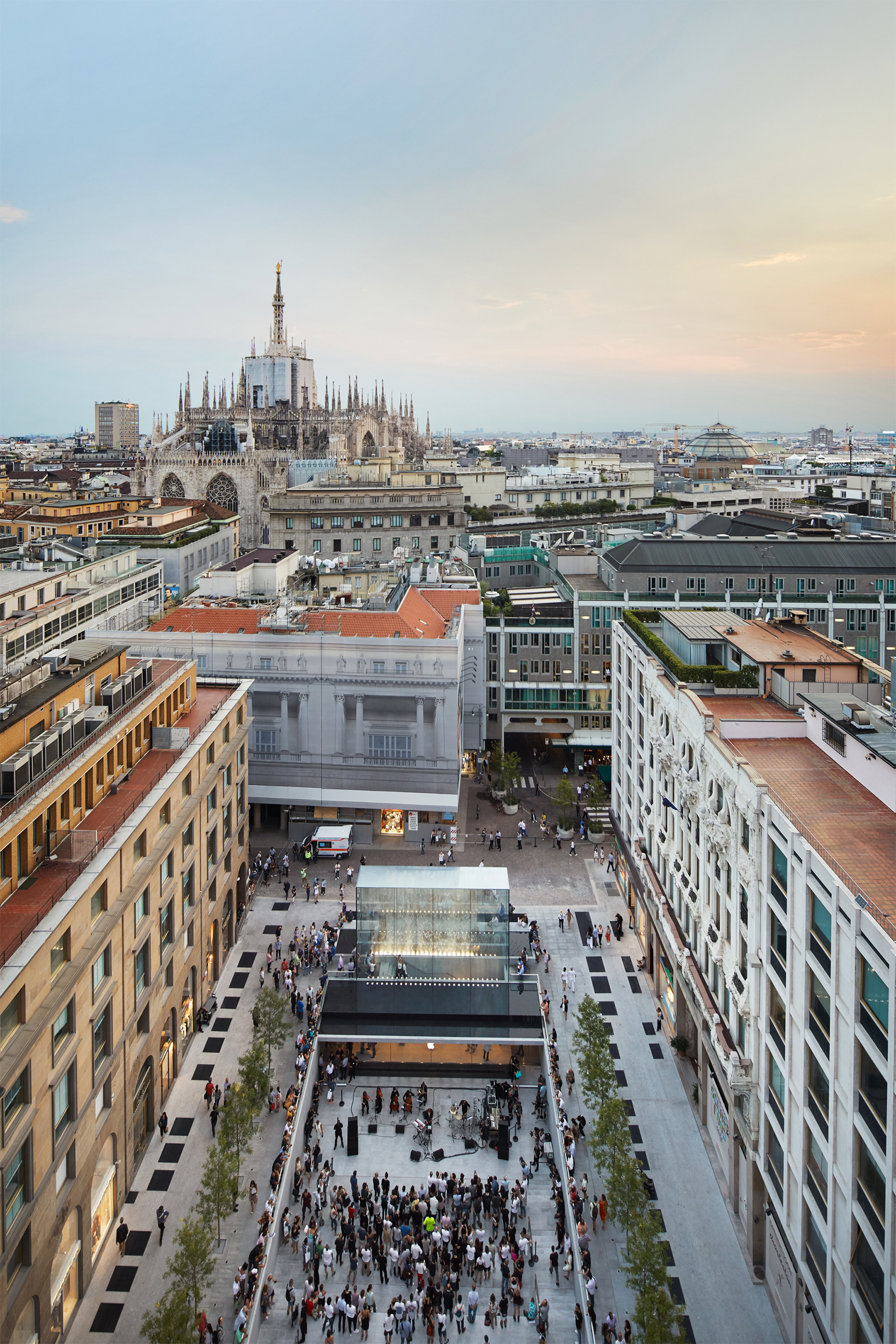
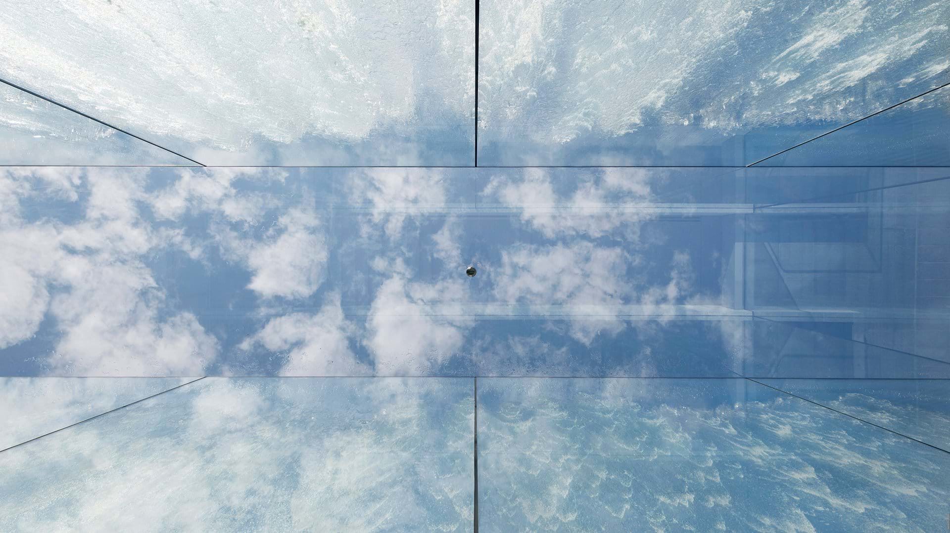
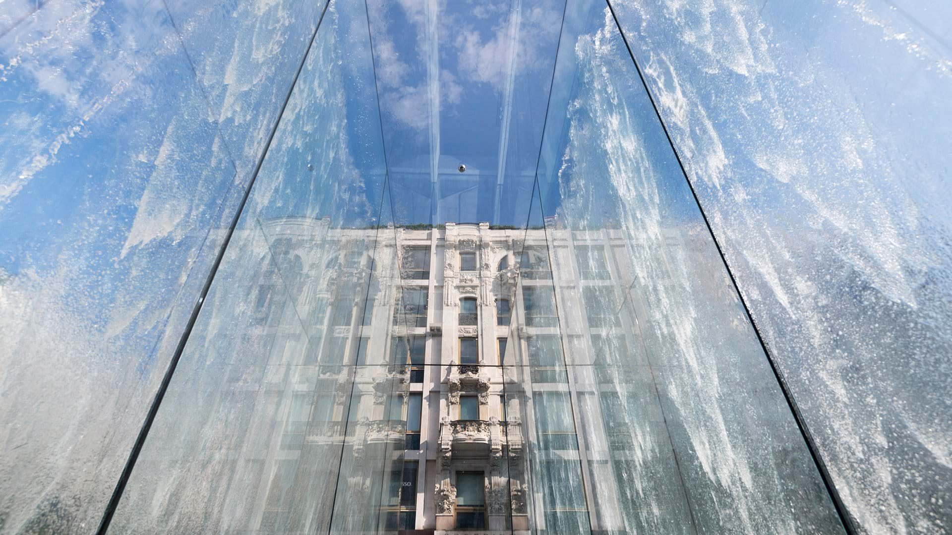
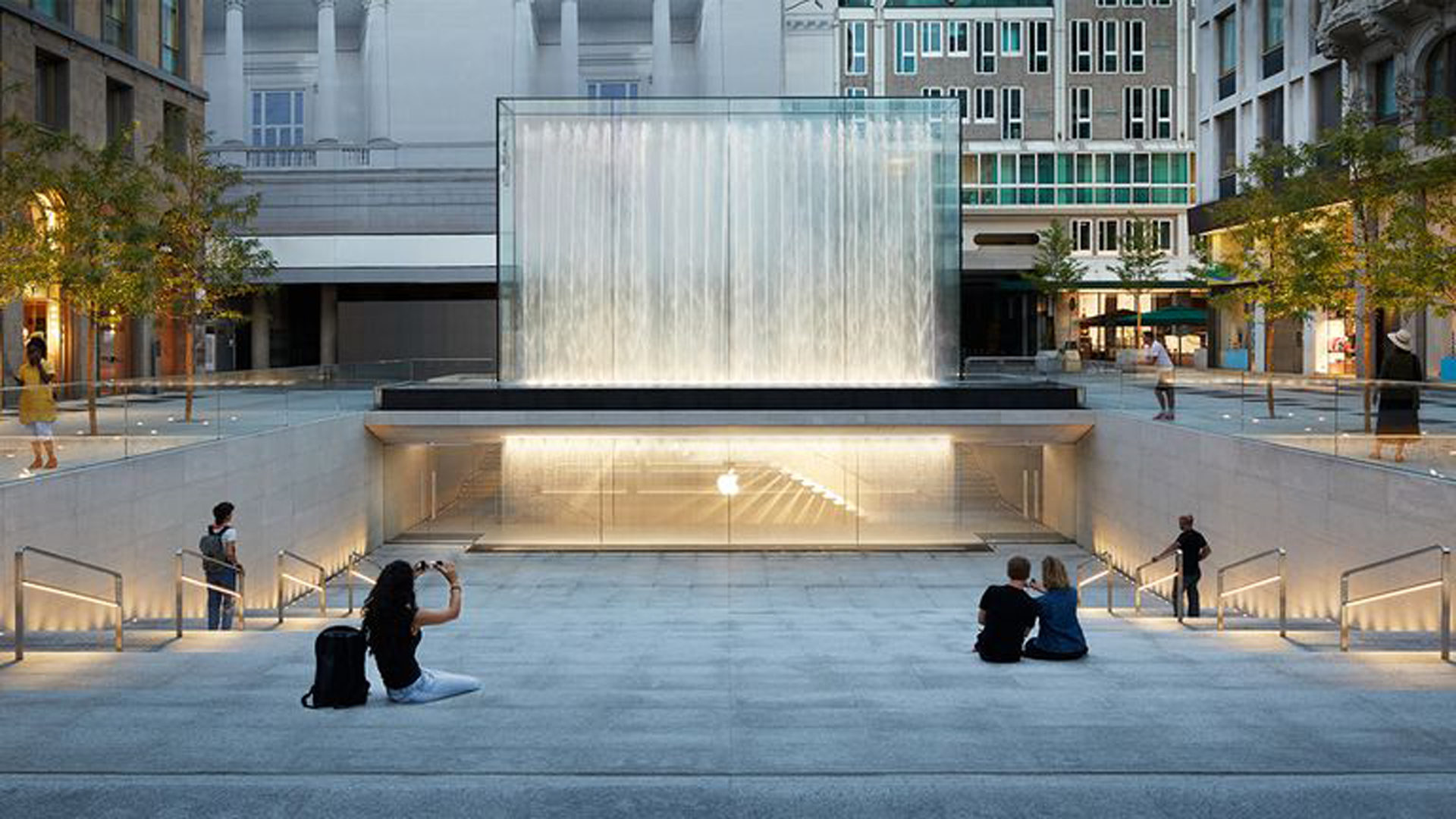
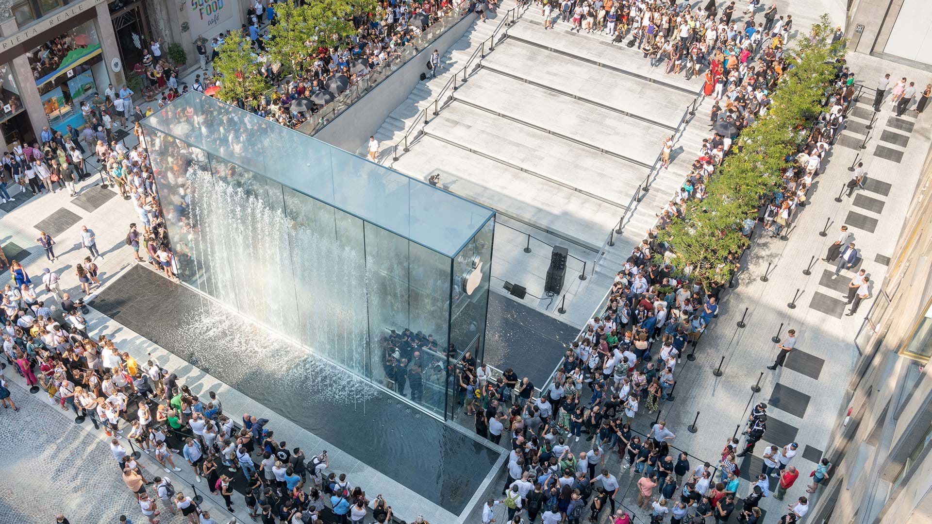
Children getting wet playing in the fountain is an important recurring image, just like those who play in the fountain of piazza Gae Aulenti, the centre of Milan’s most modern area. “The fountain is an expression of child-like excitement that speaks to each one of us. In its simplicity, it echoes the idea of walking into a big fountain without getting wet, and the joy of being alive.” This huge glass fountain is the entrance to the store, as the visitors enter they appear to be walking through the water, at the bottom of the structure two side entrances define an area composed of big stairs and the big logo portraying the famous apple stands above.
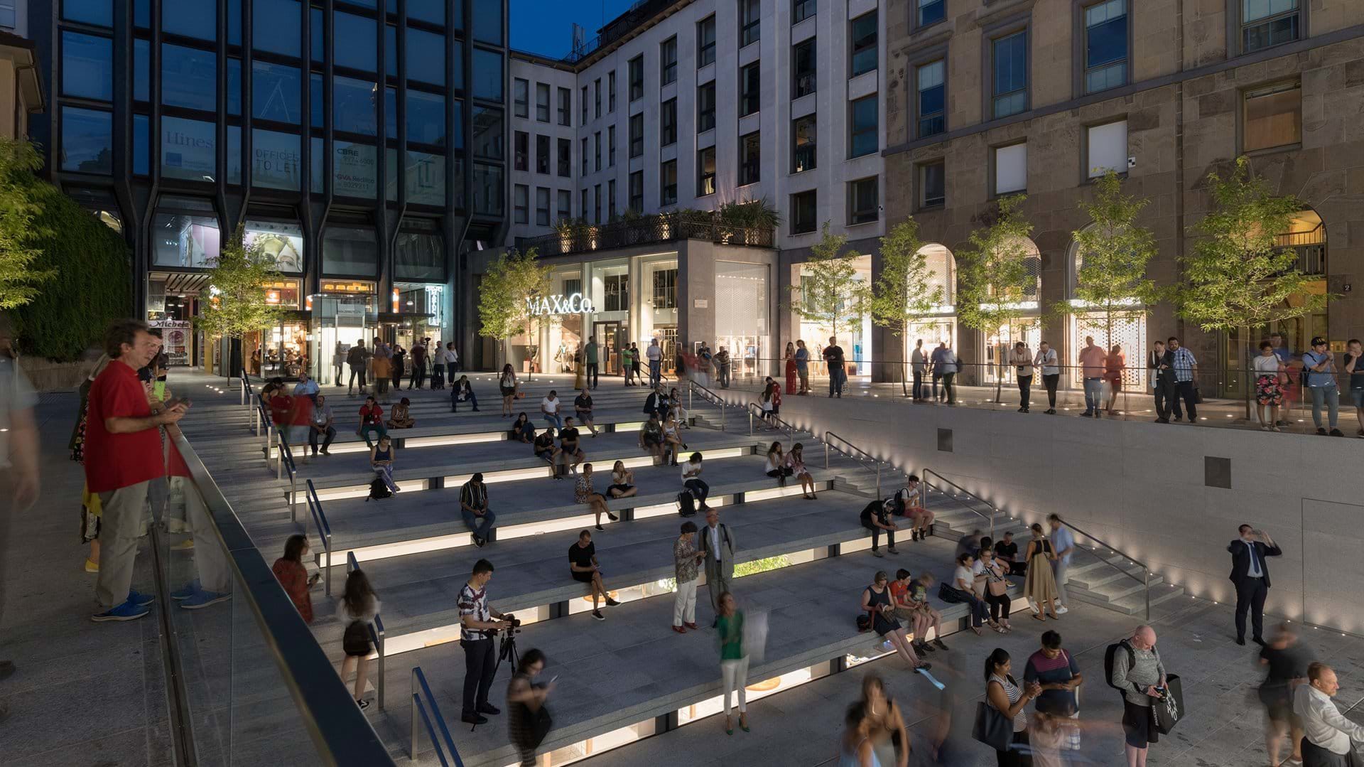
At night the building sounds like poetry.
© Foster + Partners
In less than an hour the fountain is emptied turning itself into a stage for concerts, shows and performances.
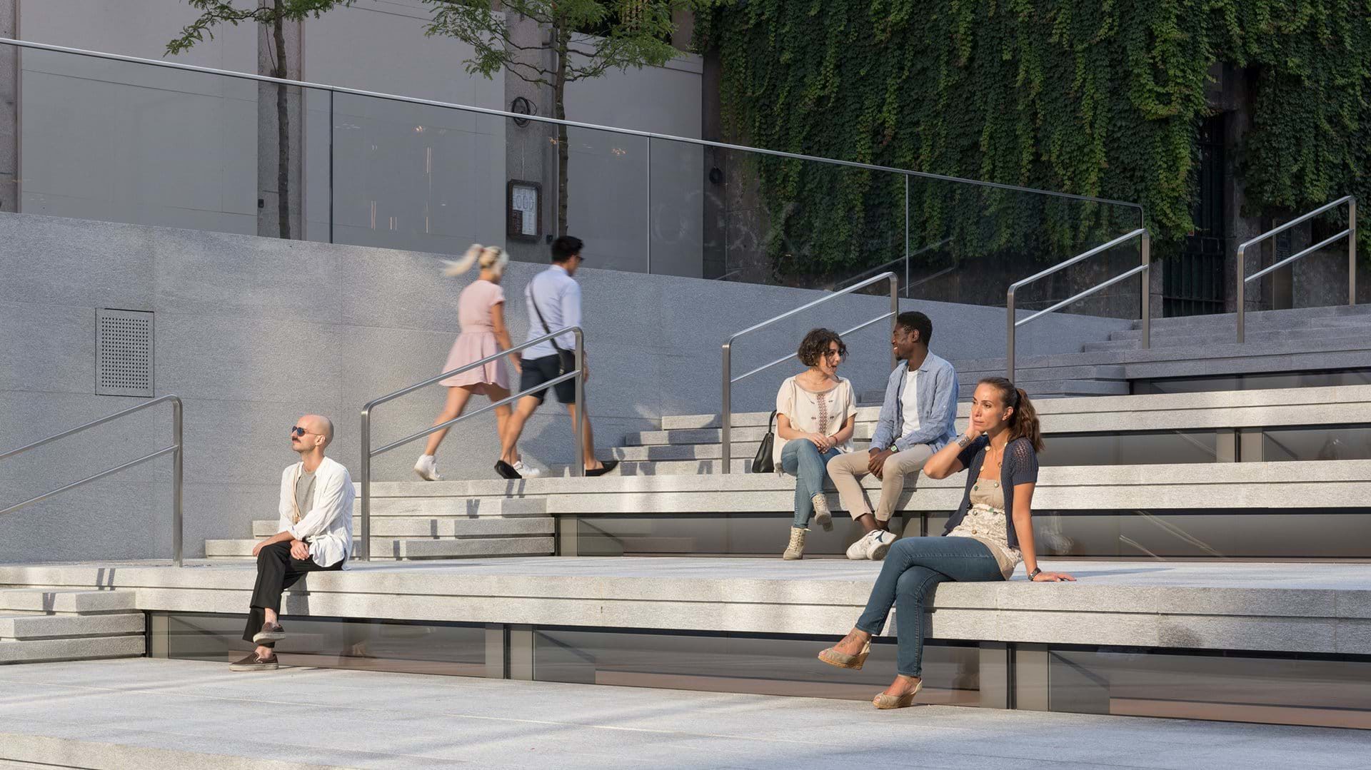
Once connected to the store, from the hypogeal square where the popular Apollo theatre stood, you can see the glass fountain turning itself into a big screen exactly on the roof of the Apple store which is below ground level and the whole square appears as a real amphitheatre, somehow it feels like the popular Apollo theatre come back to life.
When asked to describe the accuracy of every detail Stefan Behling looks exited and a bit moved, designers’ experience is pretty clear and their target has been reached: to bring out shape and material. “We – me and Jonathan – love curves, so that you will hardly find a right angle”, as on every Apple devise. Jonathan’s work is strictly focused on details and reaches a very high level of attention and ambition. A sophisticated mathematical calculation (Bezier curves) contribute to creating an organic link between the lines and every corner gets smoothed. The air conditioning diffusers are made by modelling the stone and become one with walls and ground, the speakers are hidden in a false ceiling.
A minimal compositional integrity of every space, a strong continuity with the outside areas, and a sculptural symmetry are clearly visible, from the seam of the glass slabs to the floor of the shop, in the hollows of the wood tables are made from, from the centre of the grids of the ground to the supporting structure up to the overhead lightnings, it all makes sense.
© Foster + Partners
Inner walls and floor are made of the same stone of the cavea, a Grey Beola, it looks like dug in the rock, the texture continuity between floor and walls is due to the particular care in cutting the stone, vertical for the walls and horizontal for the floor, the attention for every detail starts from the processing of the materials.
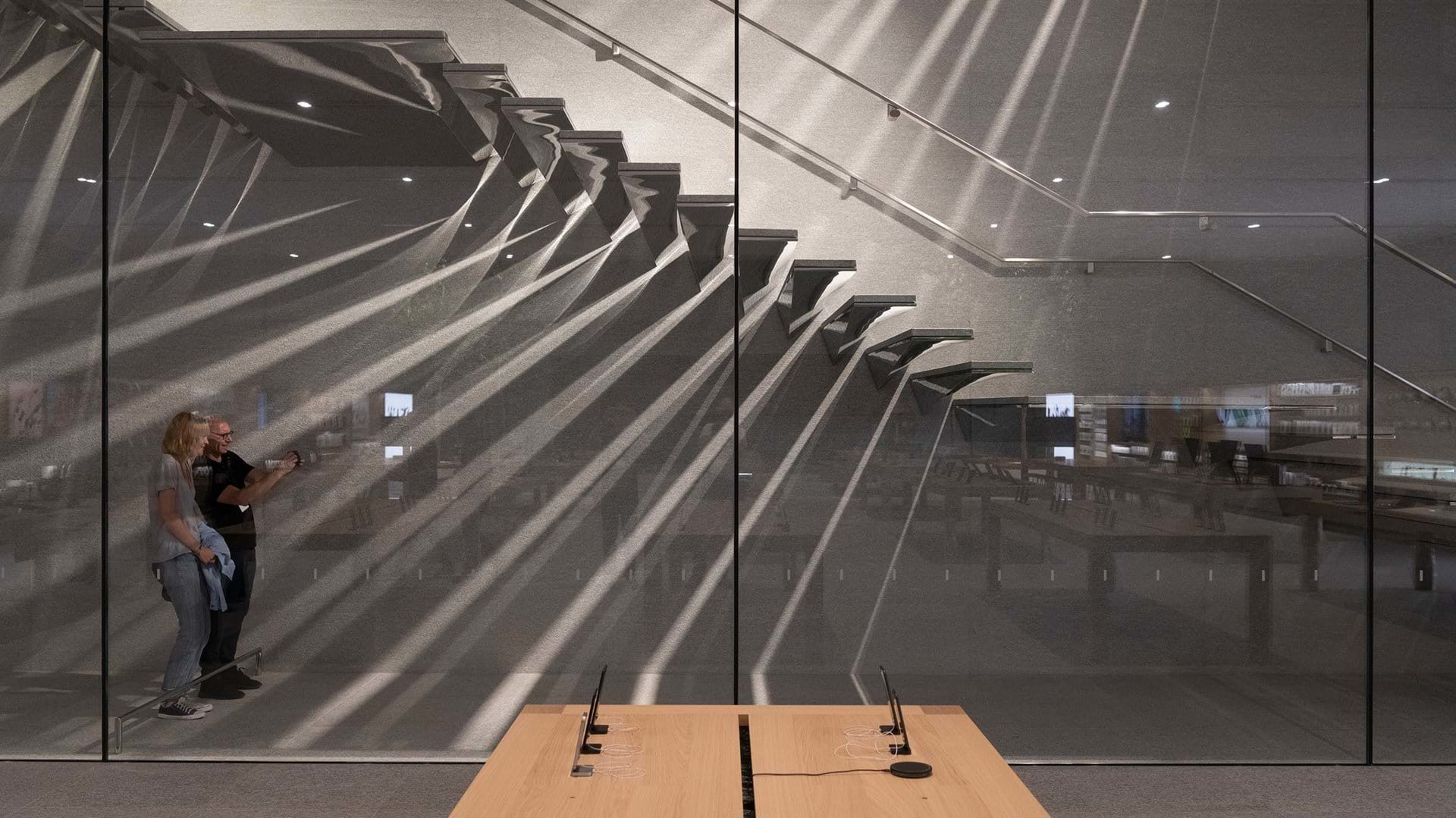
A strong and pure space the light moves in, between shadows and reflections.
© Foster + Partners
It all comes down to a few materials.
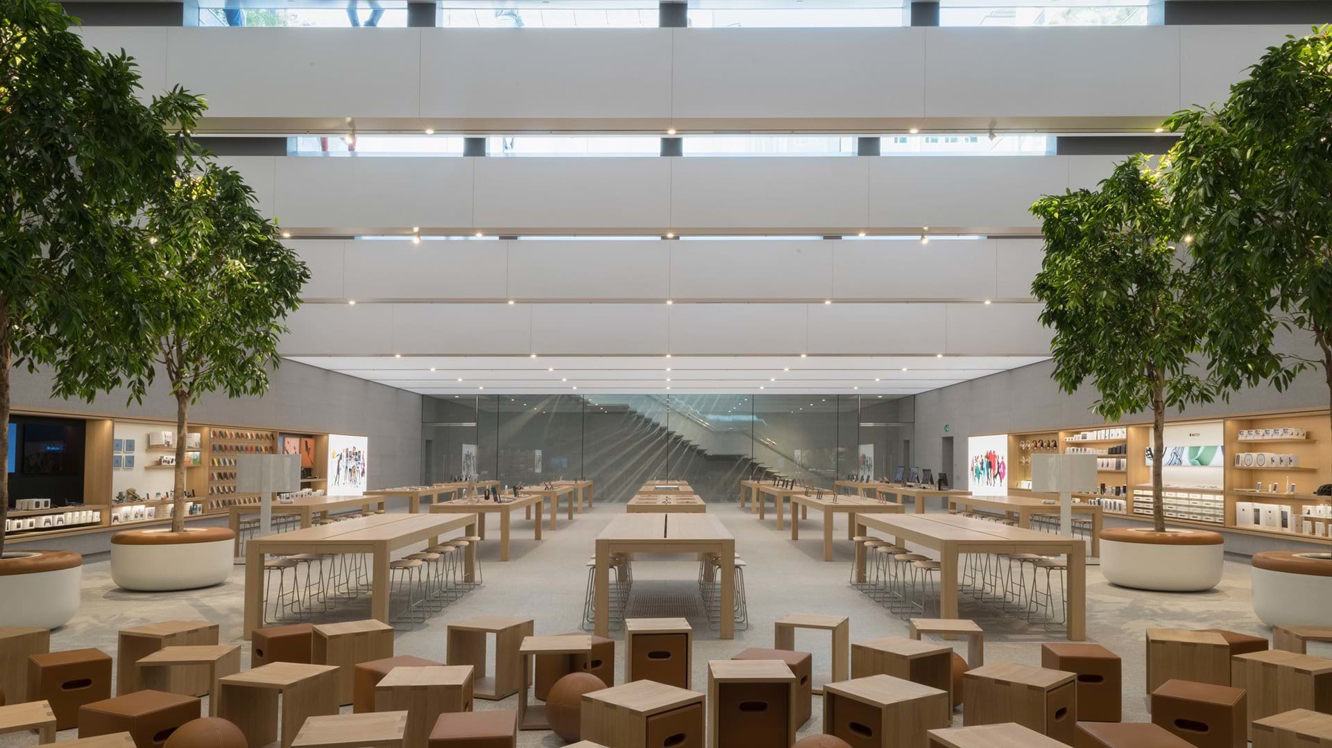
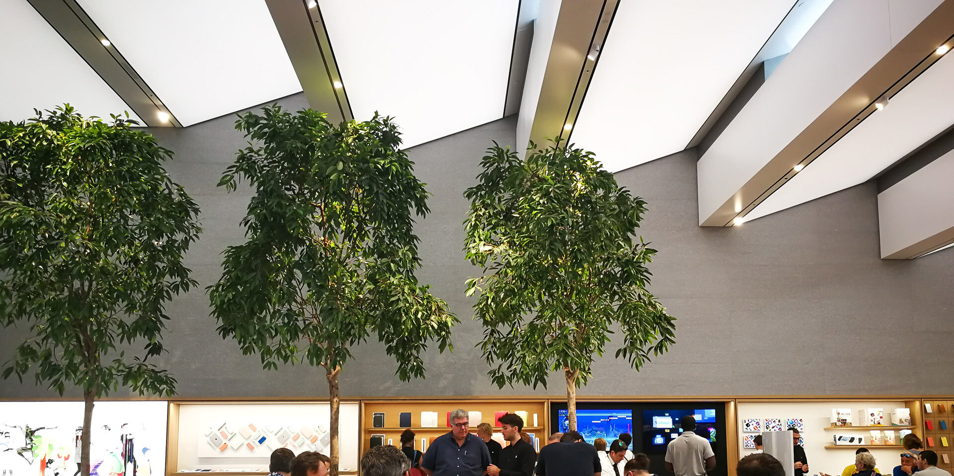
The stairs, made out of stainless steel, reflect the movement of the sun and the light of the overhead lightnings, drawing a light show on the wall cantilevered steps come out from. There are real trees of Ficus Maclellandii Alii in large leather-covered containers where you can sit. “They do not serve to clean the air, but they are not even decorative: they make the atmosphere better with moisture.” Their deep green reflects on the ceiling whose outline follows the steps of the cavea on the outside of the square. A pleasant light ploughing through glasses and panels hits the walls of the hall, artificial light mixed with natural light that makes you forget you are two floors below the ground.
The tables of the hall where the products are displayed are made from north European wood and make the whole place warmer and cozy, they are shaped with a different style, a straighter design with corners and clean cuts, it’s Jonathan Ive’s classic style enhanced with some new technological patent. In the forum there is an area meant to the exercise of different activities as lessons and projections, equipped with a 6K led wall monitor and wooden seats. The big table of the conference room is the same table of Cupertino’s design workshop, iPhones, iPads, iMacs and every other bitten-apple branded device are designed on this table, a clear sign of familiarity and relationship with the Californian parent company.
Hiroshima chairs by Naoto Kukasawa
© L. Verrecchia
The dealings and the choose of the right location took 10 years, other 4 years of planning and 1 year of building operations.
Every architecture comes from ideas and built by man
261 companies were considered, three of them strictly Made in Italy, as many as the compositional elements of the plan, water, stones and steel…
Three out of the 261 companies considered are Italian, Watercube, Campolonghi, Sice Previt, three as the main elements needed for the plan, a choice made directly by the parent company of Cupertino.
Companies with great experience and well known to Jonathan Ive, these companies made possible the realization of the plan turning their raw materials into an architectural masterpiece.
Many hours and researches spent in laboratories and on the building site, dealing with prototypes and designers.
Watercube

It’s been a long time since Moses crossed the Red sea nevertheless the element of surprise is die hard and we are not still used to.
It’s the icon!
The architectural element of this place: the fountain.
An emotionally charged visual attraction for the achievement of which the company of Cupertino called on Barbara Borriero. CEO of the Watercube Inc. Barbara Borriero promptly took the call proving to be one of kind and a determined woman.
“We’ve been working very hard”, said Barbara, “This fountain will give back great charm to the square”
No question about it.
With its fifty-two nozzles the upper fountain is 8-meter-tall and has three different possible configurations that change as the hours of the day pass or in accordance with particular events. By means of wind sensors on both sides put to control the water jets, the fountain creates a microclimate during the hottest months, experts have been working hard to reduce the water jets on the glass. The lower waterfall is the second attraction of the store. A cave spilling water from its 8000 nozzles put on six different rows. Transparencies, refractions and games of light conclude the masterpiece. Something really amazing.
A black stone called “Luna Black” has been used to cover the inside of the fountain, solution suggested by Campolonghi Inc. A system of machines able to dispense 7,3 cubic meters of water per second, let’s consider that a common family consume one cubic meter of water per day, make the water-game possible.
Campolonghi

Massa Carrara
7.775 stone slabs
27 different thicknesses
80.000 cobblestones
“Apple Inc. is never satisfied by the supplies of the market, always looking for something new” said D’angelo, business heir of Carlo Campolonghi.
The new store of piazza Liberty has its surface totally covered of Grey Beola, a stone coming from the Lombard mounts, affirms D’angelo, even though some says it’s from Swiss… chosen after two years of study, its shades of grey are familiar to the city.
The accuracy of the company is well known, the airport of Dubai and the Burj Khalifa skyscraper, the terminal of Abu Dhabi, the Vertical Forest in Milan, the partnership between the two companies is well known since the days of the most iconic Apple store in NY, the Cube on the 5th.
The store is equipped with paths for visually impaired people, dug in the rock, along which they are led by acoustic signals. “We have teamed with the I.N.M.A.C.I. (A national institute for visually impaired people), normally this system is made by well certified companies but in this case, we have developed a new one and once got the planning we have created a new system ex-novo” Said D’angelo.
Sice Previt

Segrate
Born in 1961 Sice Previt is a leading company in designing furniture and finishing, since 2003 got into the fashion business with a team composed of young and very motivated people. This company employees 340 workers between the age of 30 and 35.
Marco Contini, project manager, explain how hard to please Apple Inc. is, nearly obsessive.
“Bending, materials, finishing: every little detail chosen after having considered different options.
Beside handrails and handles prototypes, the structure of the stairs posed many difficulties, “Their particular shape, long with a little twisted. We needed architectural and structural details match.
The particular location of the shop, a square in downtown Milan, brought some problems, explains the contractor Contini. Piazza Liberty is a popular location with a great historical interest and it wasn’t easy to carry out the works. “Logistics has been a great challenge, so many rules to follow.” Explains Contini. These kinds of works are very invasive: we have had to deal with problems related to loud noises and dust, we have had to limit the use of motor vehicles and every day we have had to take away all the debris…”
After those of Florence and Colony this is the third work for Apple Inc. “These assignments test you and at the same time they teach you how to overcome the hardest impediments, a very exciting time.”
© Foster + Partners
“We want to leave the world better than we found it.” Says Stefan Behlig quoting Tim Cook, chief executive officer of Apple Inc. “We think this square is better than before. Thanks also for the close cooperation with the city of Milan, who could understand the innovative aspect of our project.” More, “The contributions paid by Apple have largely gone to finance the peripheral plan,” explained Pierfrancesco Maran, Urban Advisor for Urban Planning, Green and Agriculture in Milan.
Modern cities need this kind of works. Architecture has a great responsibility, it’s the glue between man and society, the perfect link between needs and solutions, ideas and their fulfilment, economy, economy and creativity. Its effect, big or small, produces a change supported by the architect, he has the means to define the future, trying to make it a better place and Piazza Liberty is the best proof of it.
© Foster + Partners
Those who dare are destined to be judged.
For true reasons and not a lot of criticism has been directed against the Apple store of Milan, in particular they came from those who are nostalgic of the Apollo theatre who accused the company of Cupertino of having evicted the old one, others say that the owners of the theatre have made that decision. I don’t, I really don’t know, it’s a delicate matter so I’m not going to jump to speculative conclusions. The last movie was shown on January 15, 2017 and then the orange illuminated windows of Galleria de Cristoforis have been closed, for ever. Anyway, the old philosophy of the 60’s that guided the five rooms of the Apollo theatre lives on; urban renewal, social gathering and cultural enrichment have always been the priorities of the company.
I like to think about it as an upgrade of the times, a modern reinterpretation of what the Apollo theatre used to be, undisputed star of those years. It’s like a baton passing even if the decision to close a cinema is never a good decision. There has been no lack of petty criticism, a criticism without any ideas that I prefer to ignore. Allegations of failure to comply with environmental standards, the lack of paths for visually impaired people, difficulties in accessing for people with disabilities have proven to be groundless and some design flows are nothing more than just unexpected occurrences. In spite of the wind sensors the water jets wet part of the square, it’s not a problem in summer but in winter it may be. Useless details in appearance but functional.
Apple Inc. and Foster + Partners have carried out a great job in every way and I hope this part of the town will be the first to benefit but this is another story.


